
Health Direct
Overhauling a trusted source of health information. Symptom checking, Service finding, and Health information
#App UX
#Healthcare UX
#User research
#Product Design
#Lean UX
#User testing
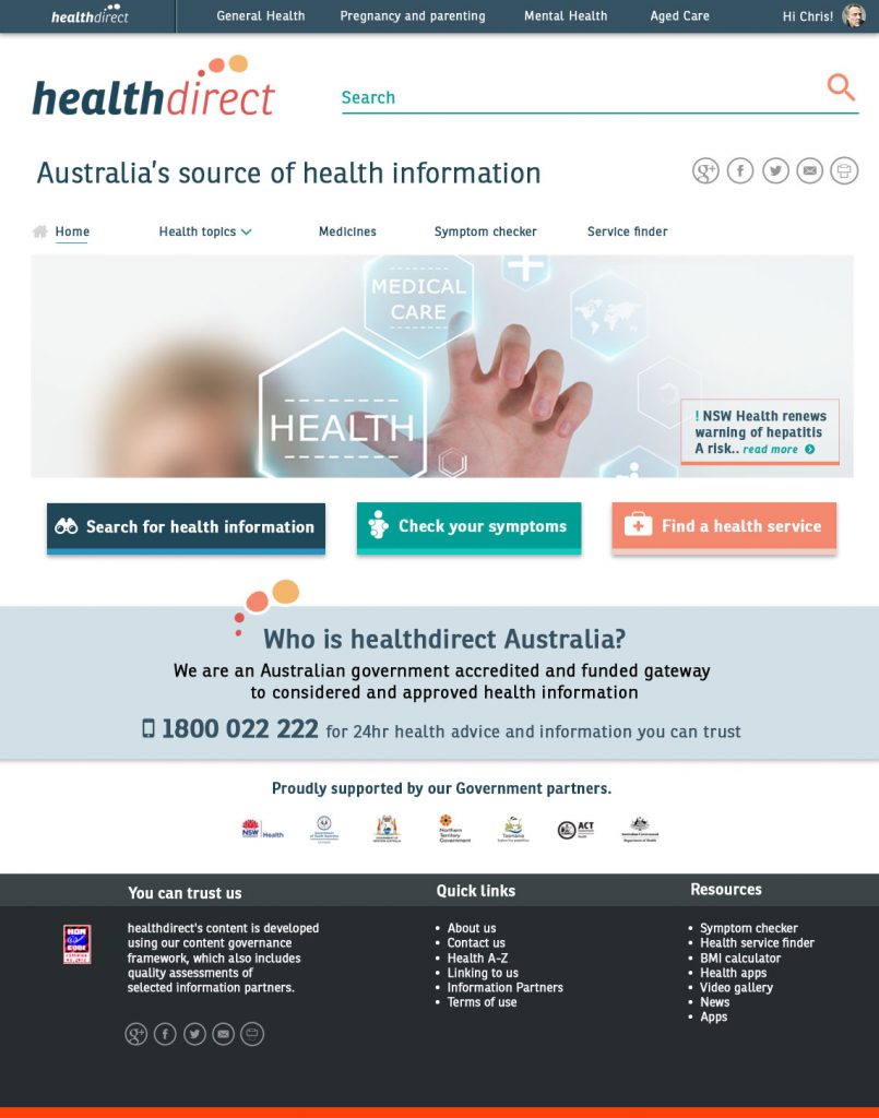
Goal: To increase health literacy, provide easy access to health services, and provide relevant health information, quickly and easily, and divert and decrease the overall traffic to Emergency rooms. Pain points: Current site was outdated, overburdened with superfluous content, bad usability rating, and no longer served the needs of both enterprise and user. Partners and affiliates were losing traction and interest and funding for HDA was looking tenuous.
DISCOVERY
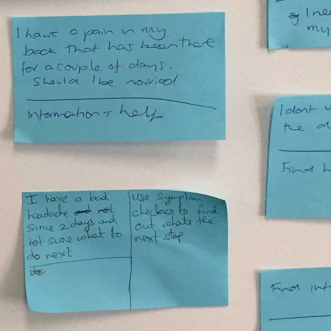
It was apparent very early in the process, that needs of stakeholders such as partners (medical foundations and organisations), pharmaceutical manufacturers, medical professionals and users were all going to need to be considered in equal proportions. Users would be need to be considered as arriving at the site from ‘Dr Google’ and early quantitative data showed us that only 11 percent of traffic entered through the ‘home’ page. Research was conducted in cooperation with ‘the Fore’ a Sydney based research facility, and one-way glass interviews were conducted, with vetted questionnaires relating to needs, wants, opinions and concerns about health issues, service finding, medicine ingredient information, health literacy and current sources of knowledge, including remote regional areas of Australia. Cultural and varied socioeconomic subjects were chosen for this research.
NEEDS:
— A trusted source of health information
— A ecosystem and taxonomy that presented relationships between active ingredients and medicines
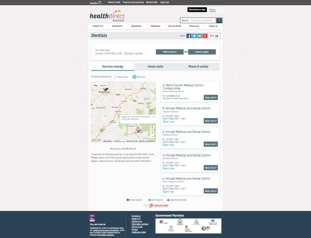
— A seamless service finder that gave users filters and options for nearest medical services
— A symptom checker, that provided considered, careful guidance on symptom concerns
— An accompanying app, that provided directions and mobile content
— Pack sizes for medicines and availabilities/stocks
WANTS:
— Health ‘literacy’
— Plain language explanations of active ingredients and allergies
— Up to date medical and institutional information
— The avoidance of unnecessary emergency department attendance
BEGINNINGS
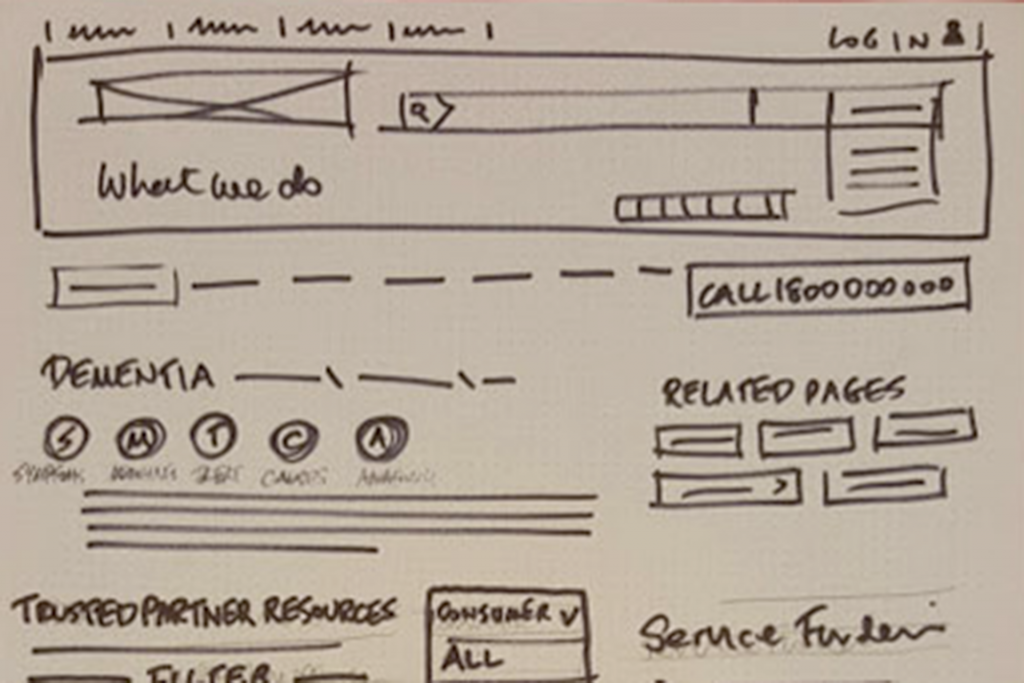
The project started off with an all stakeholders adding their contributions, via Problem statements and then goal creations. Next steps included guerilla research, lab testing, user interviews and SEO data analysis.
All learnings and data were synthesised, mapped, reframed, and presented back to the business.
UPDATES
Site traffic increased on average 27 percent over the year preceding the launch. As of June 2019, traffic has increased by 80 percent from 2015.
The app has had over 170,000 downloads to date and continues to be a source of truth for users. The sites responsive design has aided usability and accessibility, and new WYCAG adherence has aided vision impaired users to access information clearly.